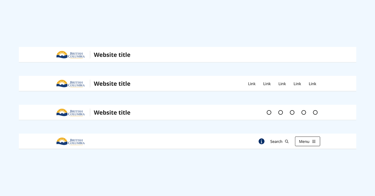
Reusable components make it easy to build consistent, accessible interfaces in Figma and React. Start using components
B.C. Design System
The B.C. Design System gives design and software development teams the building blocks to deliver intuitive, accessible digital services.
Get started with the design system
Design tokens (v3.2.0)
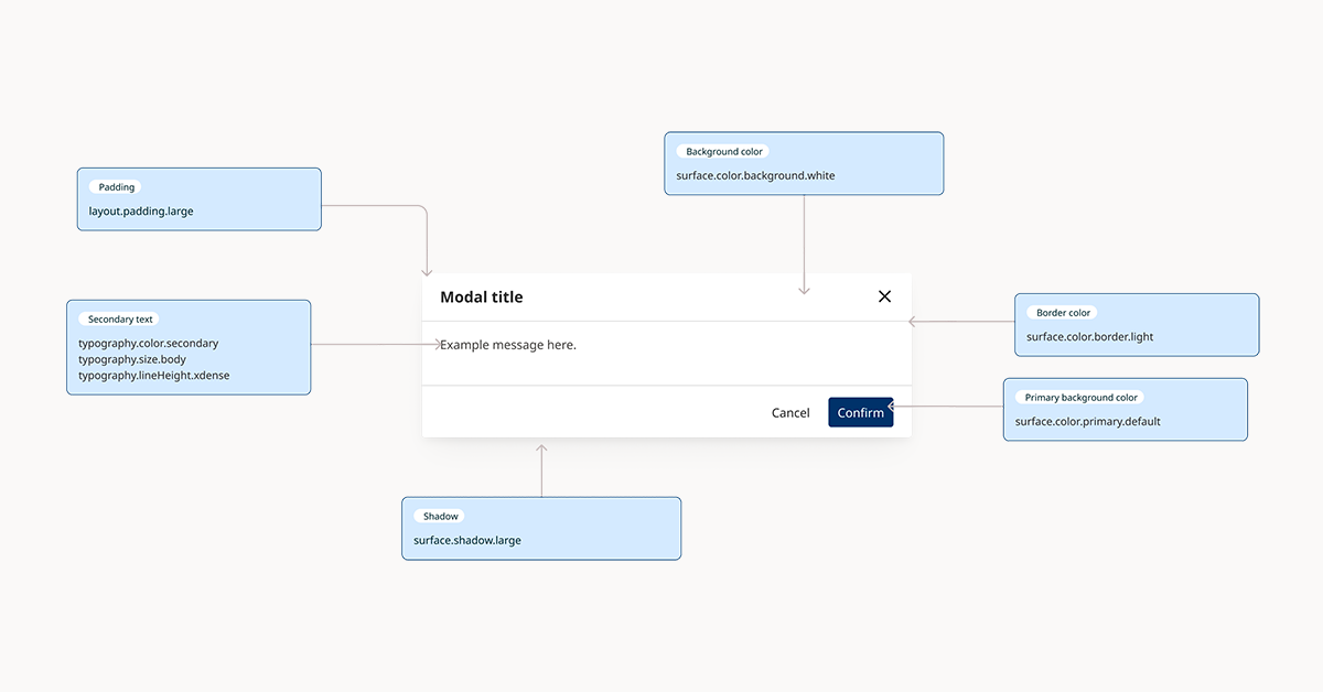
Design tokens are a source of truth for basic design decisions like colour and typography. Learn about design tokens
UI workshop
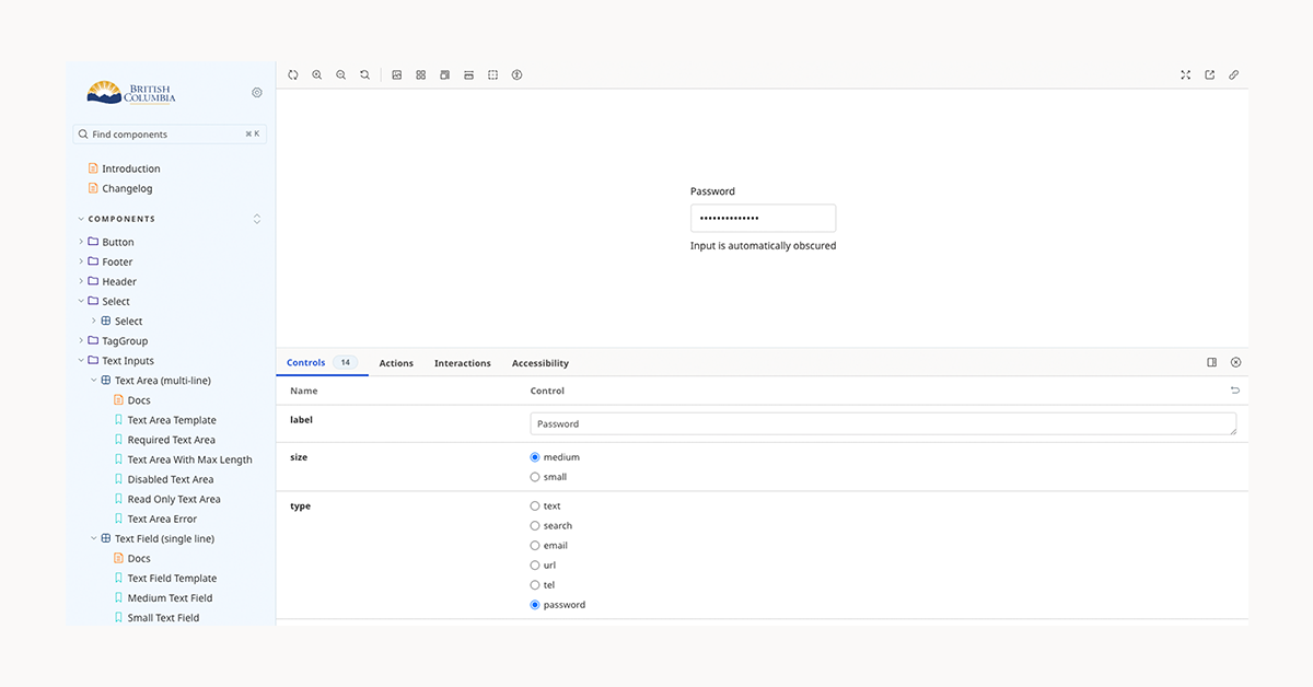
Explore technical docs, interactive previews and code for design system components. Go to the design system workshop
Services and information topics
Foundations
Guidance on layout, typography, colour and iconography.
Components
Find design assets, code and technical docs for user interface components.
Roadmap
Learn what we're working on now, and what's planned for the future.
Contribute to the design system
The B.C. Design System is open-source. There are several ways you can contribute.
Featured in B.C. Design System
Create accessible web products
Digital services must meet the Web Content Accessibility Guidelines (WCAG) Level AA standard.
Resources for developers
Access common technical documentation, community knowledge bases, code samples and APIs.
The design system is an open source project, to help software developers and designers in the B.C. government deliver a consistent digital user experience for the public. It is maintained by Service BC and Government Digital Experience, part of the Ministry of Citizens' Services.
Contact information
If you have questions or feedback, get in touch:
designsystem@gov.bc.ca
https://github.com/bcgov/design-system/issues/


