Foundations
Guidance on layout, typography, colour and iconography.
Design tokens
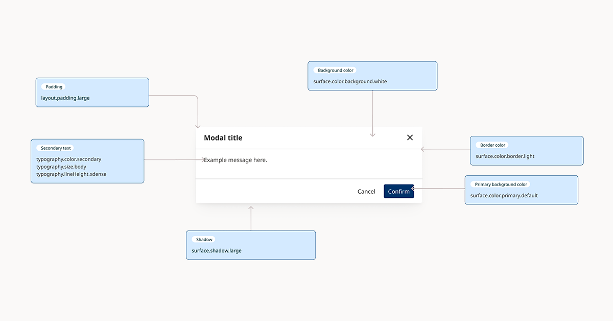
Design tokens provide a simple way to apply a standardised visual language, and make it easy to implement changes in the future.
Typography
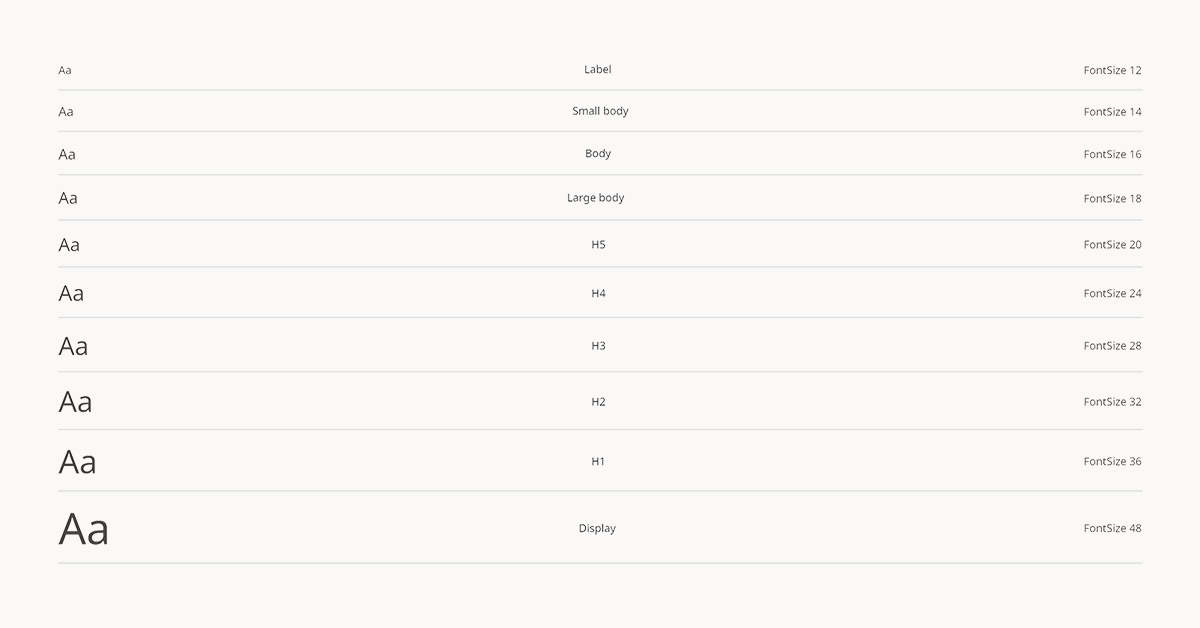
Good typography maintains a clear hierarchy of information and structures content to help users understand and navigate it.
Colour
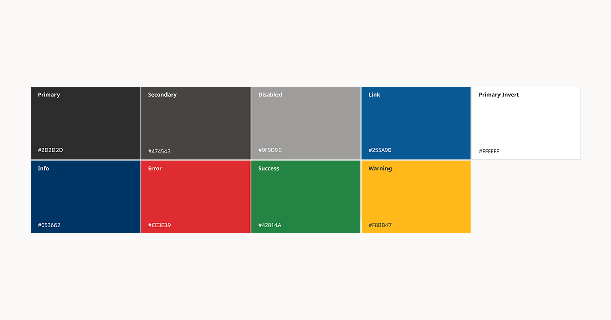
Consistent use of colour across B.C. government services helps maintain a coherent visual identity.
Create accessible web products
Digital services must meet the Web Content Accessibility Guidelines (WCAG) Level AA standard.


