CMS Lite user interface guidelines
The CMS Lite user interface allows content managers to create, modify, and arrange webpage components. It features a Rich Text Editor for easy editing, templates for structuring content, and a tree navigation system for organizing pages and assets.
On this page
- Standard functionality
- Icons
- Required fields
Standard functionality
Rich text editor
Content templates contain both text fields and rich text fields. Rich text fields are easily identifiable by the toolbar above the editing field.
Learn more about the rich text editor
Tree navigation
- Use the arrows
 to expand and collapse the Tree Navigation display
- An arrow '>' will only be displayed next to nodes that have children
Content and asset management
'Right-column boxes' are now 'Supplementary content boxes'
Right-column boxes are no longer found in the right column.
They have moved to the bottom of the webpage.
For now, you will still see them called "Right-column Boxes" in the CMS Lite interface.
- In the Content or Asset menu, click on the vertical grey bar dividing the two panes to collapse the Navigation Pane
- Click on a Banner menu item to open in the same tab. Right-click and select Open Link in New Tab
- To select an item, click in the box
 next to the file name
 -
Click on any Item Control Bar to expand or collapse a component
![]()
![]()
Deleting components
- Click the delete
 icon on the Item Control Bar of a component item to remove it, for example, a Related Links box
Character limits
Rich Text Editor field an error message will be displayed if the content exceeds the allowable limit defined in the bottom right-corner of the editor
![]()
Page and asset pickers
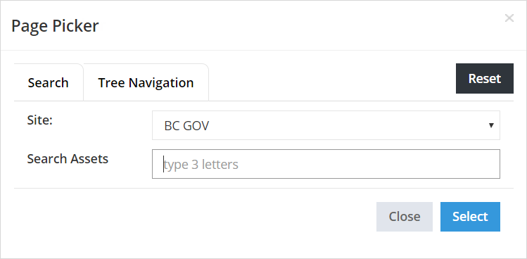
- Dynamic Pickers have been incorporated throughout the interface providing functionality to Search or Navigate to pages, assets, etc.
- Upon initial launch, in a new session, the picker will default to the search tab. If the Tree Navigation tab is selected, it will become the default until the Search tab is re-selected or when a new session is launched

- When more than 20 results are returned using the Search functionality, pagination will appear at the bottom of the picker. Hover over any of the results to see the full breadcrumb location.
![]()
- When using the Tree Navigation, a scroll bar will be presented. The independent pickers (Page, Asset , Image or Folder) will remember the last location that you browsed during the current session.
- Selecting the [Reset] button will clear the location history for the displayed picker. This will reset all pickers of that type, for example, wherever the Page Picker is used. It does not reset the history for the Asset, Image or Folder Pickers as each individual picker has its own [Reset] button
![]()
Changing interface elements
- Hold the left mouse button down to move accordion or grid panels

- Hover your mouse between the lines and click on the red box that appears to insert a paragraph block in an accordion or between grid layouts

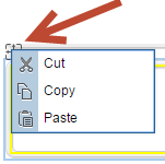
- Right-click on the Move icon and select Cut to remove a panel or grid layout


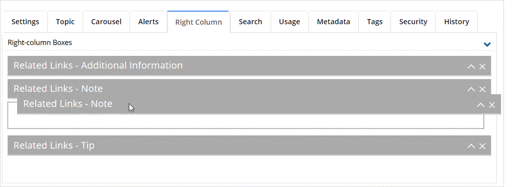
- To reorder right-column box components, left-click on the Item Control Bar, hold the left mouse button then drag and drop the component to the new location
Unsaved changes warning
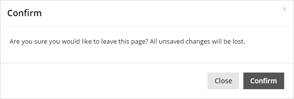
- If edits are made to a node, but not saved, a CMS Lite dialogue box will be displayed if you move to another node in the Navigation Tree
- If you click outside of CMS Lite dialogue box, the [Close] action invoked

- If edits are made to a node, but not saved, a browser warning message will be displayed if you move to another menu item

Icons
| Icon | Meaning |
|---|---|
 |
The key icon indicates that a file is locked by you. Files remained locked until they are published to Production web server, or the [Unlock] action is invoked. |
 |
The file is locked by another user. Hover over the lock to display the IDIR account. You can unlock another person's file, but it is recommended that you communicate with the person beforehand. Files remained locked until they are submitted to the Production web server, or the [Unlock] action is invoked. |
|
Page/asset has been saved with no validation errors. The page/asset can be published to the Production web server. |
|
|
Page/asset has been saved but validation errors exist. Therefore, it cannot be published to the Production web server. An attempt to publish will result in a red failure message "Publish was unsuccessful. Validation errors were found in the selected page(s)." being displayed in the top-right corner of the pane. Validation errors occur when required fields are left blank. |
|
|
Folder icons are used in the Assets and Tags panes. Folders are used to contain additional items. |
|
| The most current version of the page (node) has been published to the Production web server. | |
|
Page is modified, but not locked. The Settings tab of the page will indicate who last modified the page and when. Modifications have not been published to the Production web server. |
|
|
Page is locked by you, but not modified. The most current version of the page is in the Production web server. |
|
|
Page is modified and locked by you. Modifications have not been published to the Production web server. |
|
|
Page is locked by another user, but not modified. Hover over the icon to display the IDIR or view the Settings tab to see who has it locked. The most current version of the page is on the Production web server. |
|
|
Page is modified and locked by another user. Hover over the icon to display the IDIR or view the Settings tab to see who has it locked. Modifications have not been published to the Production web server. |
|
| Indicates that the node is an external link. |
Required fields
Required fields exist primarily in the Content tabs and must be completed prior to publishing a page. Required fields are indicated with an asterisk (![]() ).
).
Saving a page with missing required fields
If a required field has not been completed when the [Save] action button is selected:
- A yellow message is will be displayed in the top-right corner of the pane: "The page contains validation warnings and cannot be published until they are resolved"
- A warning icon
 will be displayed in the tab(s) where missing field information exists, and the field(s) will be highlighted
The page may be viewed in the Quality Assurance (QA) web browser, but cannot be published to the Production web server until all required fields are completed.
Publishing a page with missing required fields
If the Publish action is selected from the Content Pane or the Navigation Pane:
- A red message is will be displayed in the top-right corner of the pane: "Publish was unsuccessful. Validation errors were found in the selected page(s)".
![]()


