Checkbox group

A checkbox group enables the user to select one or more options from a list.
On this page:
How to use this component
A checkbox group enables a user to select one or more options from a list. Use a checkbox group when:
- All of the potential options are predefined
- The user can select multiple options
If a user can only select one option from a list, use a select or radio group instead. If the potential responses can't be pre-defined, use a text field or text area.
Structure and behaviour
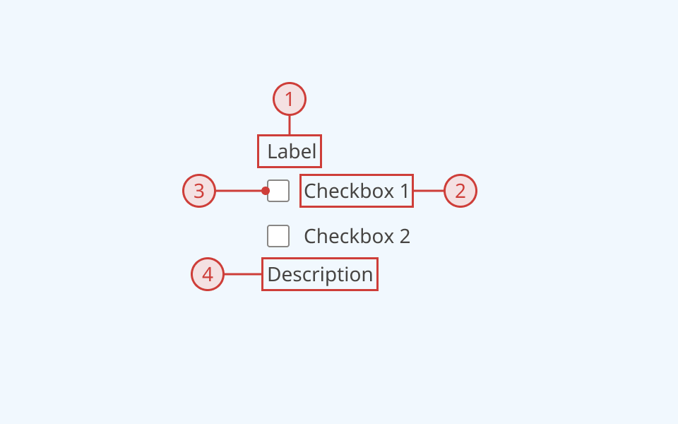
Anatomy

- Group label, to explain the purpose of the input
- Secondary label, indicating whether a selection is required
- Selector
- Selector label
- A text description below the input field, to provide additional helper text (optional)
An error message can also be displayed below the description when needed.
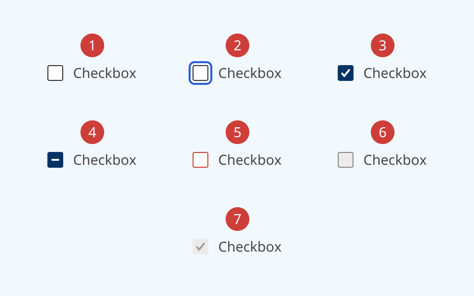
Radio groups support the following states:
- Hover
- Focused
- Selected
- Indeterminate
- Invalid
- Disabled
- Read-only
Behaviour

- At reset, each checkbox is in its default state
- When a checkbox group is focused, an offset blue focus ring appears around the first item in the list
- The user can move focus through the list using the 'Tab' key
- Moving focus through the list does not change selection state
- The user can select or de-select an option by pressing the selector or label
- They can also use the spacebar or 'Enter' key to select or de-select the currently-focused option
- When an item is selected, the selector box is filled in and receives a white checkmark icon
- If needed, a checkbox can be set to an indeterminate/mixed state, and shows a dark blue fill and a white dash icon
- When the selection is invalid:
- Unselected items receive a red border around the selector
- A selected item receives a red border and fill, and the label text changes to red
- A red error message and icon is rendered below the input
- When one or more options are disabled:
- The selector and label change to grey
- A cursor indicator is shown on hover to indicate that it is disabled
- A disabled option cannot be focused or interacted with
- When a selected option is disabled, its fill and icon change to grey
Design guidance
Design system components are published in a Figma library. Install the library and add it to your project to start using this component.
A checkbox group has two parts:
- Individual list items, each with a selector and a text label
- The group itself, with label, description and error message fields
Each part has its own set of controls.
If your use case requires hiding the group label, you must also provide a non-visible label using the aria-label property.
Technical information
Detailed technical documentation, interactive previews and code samples are published in the B.C. Design System Storybook.
A reference implementation of the checkbox group component in React is published in the React components library. Install the package via npm to start using the component.
The component is comprised of two subcomponents:
- Checkbox: an individual list item, with a unique identifier and a text label
- CheckboxGroup: a semantic wrapper, that labels a group of checkboxes and handles data validation and submission
Events and props
The checkbox group component is a styled version of the React Aria CheckboxGroup. It uses Checkbox to populate individual list items.
Refer to the React Aria documentation for detailed information about:
Accessibility
These summaries reflect the component used as provided. If you modify it, confirm that your changes comply with the Web Content Accessibility Guidelines (WCAG). B.C. government digital services are required to meet the WCAG Level AA standard.
| Requirement | WCAG Success Criterion | Validation |
|---|---|---|
| Make sure visual formatting is represented in the backend code | 1.3.1 (Level A) |
Group label and list are automatically associated via an aria-labelledby attribute |
| Clearly define the purpose of input fields | 1.3.5 (Level AA) |
The checkbox group has a visible label, used to explain its purpose Note: if you do not use the label property, you must use aria-label to provide a semantic label |
| Make websites keyboard accessible | 2.1.1 (Level A) |
Checkbox group is focusable and fully operable using only the keyboard, with visual indicators for focused elements |
| Prevent keyboard navigation traps | 2.1.2 (Level A) |
When in focus, the user can exit the radio group by pressing the 'Tab' or 'Escape' keys |
| Ensure content reads in the right order for people using assistive technology | 2.4.3 (Level A) |
Focus moves through list options vertically from top to bottom |
| Show where the keyboard is active on the screen | 2.4.7 (Level AA) |
Focused elements are indicated with an offset border ring |
| Make sure components can be read and used by assistive technology | 4.1.2 (Level A) |
Group label and list are automatically associated via an aria-labelledby attribute. The list has the "group" role |
