Dialogs

A modal dialog presents critical information or actions to the user, blocking interaction with the rest of a user interface.
Modal component
Modals are highly interruptive. They should be used sparingly, to provide critical information and/or direct the user to confirm or take a specific action.
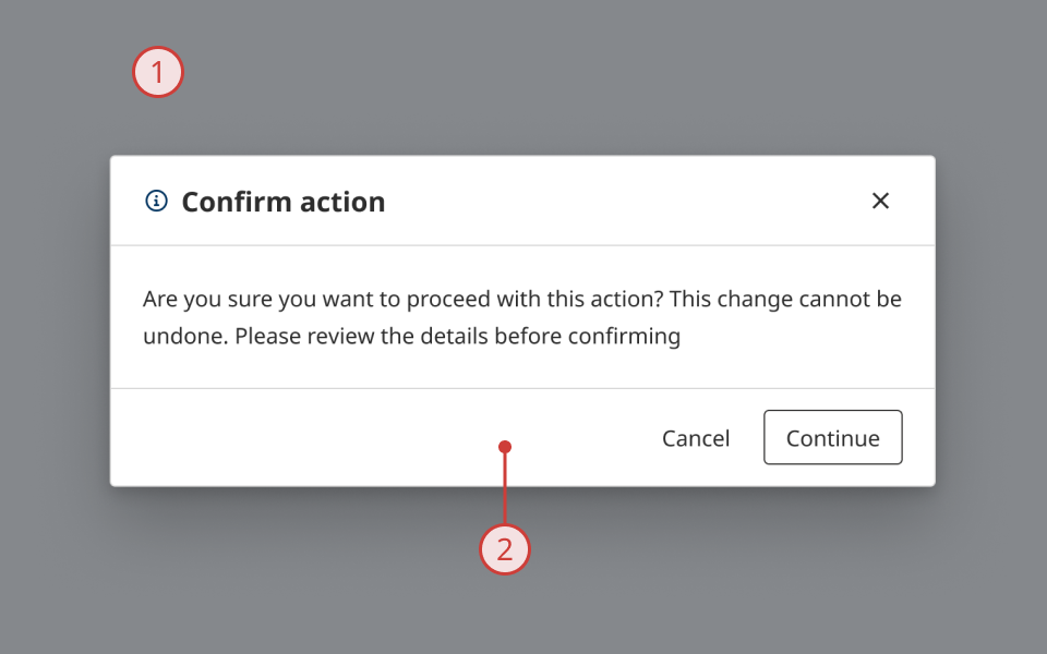
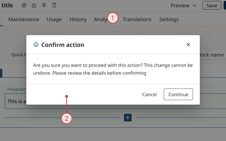
The modal component creates a tinted overlay when triggered by a user action or event. A modal overlay covers the full area of the viewport, and blocks interaction with the rest of the user interface until it is dismissed or the user takes a pre-defined action.
Modals are useful for:
- Situations where the user needs to take a specific action or provide essential information to proceed
- Warning the user or asking for confirmation before taking an action
Structure and behaviour
Anatomy

- Dark overlay, obscuring the UI and highlighting the modal content
- Modal container, to display dialog content
Behaviour

- When activated, the modal overlay obscures the rest of the UI
- Content behind the modal cannot be interacted with until it is dismissed
- Page scrolling is automatically disabled
- Modal container and its content renders in the centre of the screen
Dialog components
Dialog components nest inside modals, and contain the content and components displayed to the user when a modal is active.
The design system includes two dialog components:
- Alert Dialog: a pre-composed layout
- Dialog: an empty container with minimal styling, for composing custom layouts
Alert Dialog
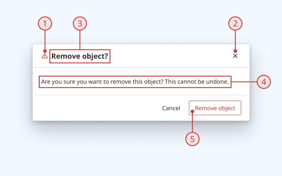
Alert Dialog provides a standardised layout, designed to support most common notification or warning use-cases.
Anatomy
- Variant icon (optional)
- Close button (optional)
- Dialog title
- Dialog description
- Action buttons (optional)
Generic dialog
The developer library also includes an empty dialog component that ships with minimal styling. You can use this component to compose your own dialog UI, if the Alert Dialog format doesn't fit your use case.
Design guidance
Design system components are published in a Figma library. Install the library and add it to your project to start using this component.
A modal overlay should cover the entire viewport when activated. Do not place a modal over only part of your UI. The dialog should be positioned in the centre of the viewport.
Controls
Alert Dialog
| Control | Options | Description |
|---|---|---|
| Type |
|
|
Technical information
Detailed technical documentation, interactive previews and code samples are published in the B.C. Design System Storybook.
Reference implementations of the modal and dialog components in React are published in the React components library. Install the package via npm to start using the component.
Events and props
These components are based on React Aria's Modal and Dialog components. Each has its own set of supported props.
Modal
The modal component renders a blocking overlay and a container element, which expects a Dialog or Alert Dialog to be passed as a child.
Dialog and Alert Dialog
Dialog and Alert Dialog enable you to pass content and other components as children, to be displayed when a modal is active.
Activating and dismissing a modal
Dialog and Alert Dialog components provide a subcomponent called DialogTrigger, which provides a simple method to activate a modal.
You can activate a modal using DialogTrigger in conjunction with an element like a button. You can also make a modal controlled, and activate it programmatically.
By default, the user can dismiss a modal by pressing 'Escape' or clicking outside the dialog. You can use props on modal and dialog components to configure how and when the user can dismiss a modal.
Accessibility
These summaries reflect the component used as provided. If you modify it, confirm that your changes comply with the Web Content Accessibility Guidelines (WCAG). B.C. government digital services are required to meet the WCAG Level AA standard.
| Requirement | WCAG Success Criterion | Validation |
|---|---|---|
| Make sure visual formatting is represented in the backend code | 1.3.1 (Level A) |
|
| Make websites keyboard accessible | 2.1.1 (Level A) |
|
| Prevent keyboard navigation traps | 2.1.2 (Level A) |
By default, a modal can be dismissed using the 'Escape' key |
| Ensure content reads in the right order for people using assistive technology | 2.4.3 (Level A) |
|
| Ensure user interface components behave predictably | 3.2.1 (Level A) |
Modal is not activated or dismissed on focus change |
| Make sure components can be read and used by assistive technology | 4.1.2 (Level A) |
Dialogs render with the ARIA dialog role by default. They can optionally be set to use the alertdialog role instead |

