Switch

A switch enables the user to toggle an option on or off.
On this page:
How to use this component
A switch provides a method for the user to toggle a setting or option between binary states (for example, 'on' and 'off'.)
They are commonly used in settings and configurations screens. They are also often used for:
- Switching between different interface modes (eg. a dark mode)
- Enabling or disabling part of a UI
Switches are particularly useful in space-constrained contexts like sidebars or navigation menus.
Structure and behaviour
Anatomy

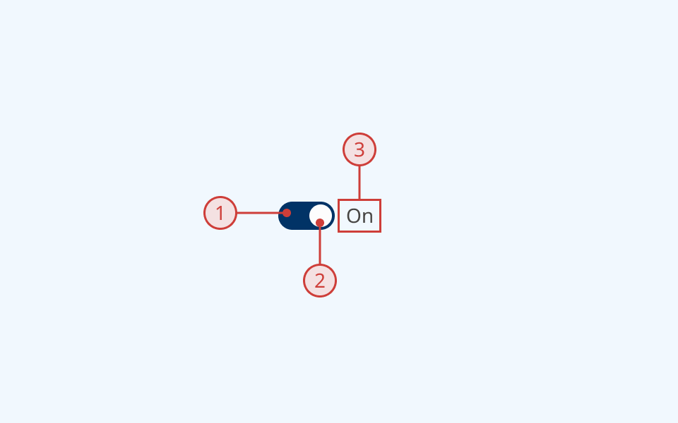
A switch has:
- An oval container
- A circular indicator whose position indicates the toggle state
- A text label to describe its purpose
Behaviour

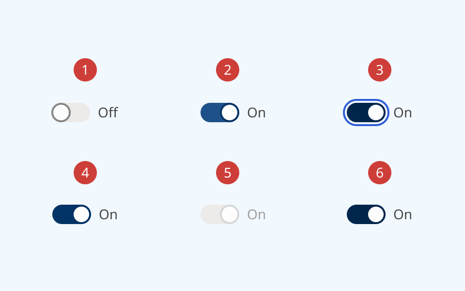
- By default, a switch renders in the 'off' position
- On hover, the border cursor and switch colours change
- When the switch is focused, it receives an offset focus ring
- When the user toggles the switch, the indicator moves to the opposite position and the colour changes
- A disabled switch is greyed out and cannot be focused or toggled
- A read-only switch can be focused, but cannot be toggled
Design guidance
Design system components are published in a Figma library. Install the library and add it to your project to start using this component.
Switches are generally used to help a user navigate and manipulate a UI, rather than for data input. In a form context, radio buttons are a more familiar pattern for most users.
If you hide the switch label, you must also provide a non-visible label using the aria-label property.
Controls
| Control | Options | Description |
|---|---|---|
| State |
|
Toggles between different interaction states |
| Active |
|
Sets the position of the switch |
| Layout |
|
Sets display and positioning of the label |
Technical information
Detailed technical documentation, interactive previews and code samples are published in the B.C. Design System Storybook.
A reference implementation of the switch component in React is published in the React components library. Install the package via npm to start using the component.
Events and props
The switch component is a styled version of the React Aria switch component.
The component supports props to configure:
- Label text
- The position of the label
- Whether the switch is on or off by default
- Enabled/disabled and read-only status
Refer to the React Aria documentation for detailed information about:
Accessibility
These summaries reflect the component used as provided. If you modify it, confirm that your changes comply with the Web Content Accessibility Guidelines (WCAG). B.C. government digital services are required to meet the WCAG Level AA standard.
| Requirement | WCAG Success Criterion | Validation |
|---|---|---|
| Clearly define the purpose of input fields | 1.3.5 (Level AA) |
The switch has a visible label, used to explain its purpose Note: if you do not use the label property, you must use aria-label to provide a semantic label |
| Make websites keyboard accessible | 2.1.1 (Level A) |
Switch is focusable and fully operable using only the keyboard |
| Prevent keyboard navigation traps | 2.1.2 (Level A) |
When in focus, the user can exit the switch by pressing the 'Tab' key |
| Let people choose how they navigate content | 2.4.5 (Level AA) |
Switch is keyboard-operable, and has a visible hover/focus state |
| Show where the keyboard is active on the screen | 2.4.7 (Level AA) |
Focus state is indicated by an offset border ring. Hover state is indicated by a different background fill and cursor |
| Make sure interaction or click targets meet a minimum size | 2.5.8 (Level AA) |
Note: Switch target area is 40px by 20px. Switch must be properly spaced relative to other interactable elements to conform to 2.5.8 |
| Ensure user interface components behave predictably | 3.2.1 (Level A) |
Switch state does not change when focused |
| Make sure components can be read and used by assistive technology | 4.1.2 (Level A) |
Switch is semantically identified as an <input> with the ARIA "switch" role |
