Inline alert

An inline alert displays an important message to the user.
On this page:
How to use this component
The inline alert displays an important status or informational message in a visually distinctive way. They can be used to:
- Show a global message to all users
- Show a dynamic message to a user based on their actions
Inline alerts are not interruptive. They do not necessarily require the user to take an action to continue navigating an interface.
For system-level alerts, you may wish to use an alert banner instead.
Structure and behaviour
Anatomy

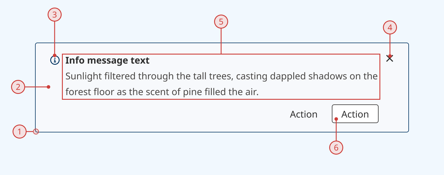
An inline alert has:
- A dark coloured border (colour dependent on variant)
- A light coloured background (colour dependent on variant)
- An icon to indicate the type of alert (optional)
- An icon to close or hide the alert (optional)
- A bolded alert title
- Description or helper text
- A slot for additional components (usually buttons)
Variants
Alert variants use different colourways and icons to give the user additional context about the nature of the alert at a glance. Four variants are included:
Info

Success

Warning

Danger

Design guidance
Design system components are published in a Figma library. Install the library and add it to your project to start using this component.
Inline alerts are intended to be displayed full-width within their parent container. They should usually positioned prominently within your interface, as they are intended to provide important information to the user. Only one alert should be shown at a time.
All of the component's parts can be toggled on or off, so you can configure the alert for your specific use case.
Controls
| Control | Options | Description |
|---|---|---|
| Type |
|
Sets the theme (colourway and icon) of the alert |
| Description |
|
Toggles display of secondary description/helper text block |
| Icon |
|
Toggles display of theme icon on the left |
| Close |
|
Toggles display of 'close' icon button on the right |
| Actions |
|
Toggles display of a swap area on the bottom right, which can be used to add buttons or other components to an alert |
Technical information
Detailed technical documentation, interactive previews and code samples are published in the B.C. Design System Storybook.
A reference implementation of the inline alert component in React is published in the React components library. Install the package via npm to start using the component.
The inline alert component renders a styled <div> with an ARIA role to identify it to assistive technologies.
Props
You can configure alert content and layout by using props to set:
- The variant theme
- The title
- Description or helper text
- Icon visibility
- Whether the user can close the alert
- The buttons displayed in the actions slot
Alternatively, you can pass your own content and/or components as children to override the default composition.
ARIA roles
By default, an inline alert renders with the ARIA "note" role. You can change this using the 'role' prop, which will accept any valid ARIA role. These are the recommended options:
- note (default)
- complementary
- status
- alert
Ensure you understand how the different roles are handled by assistive technologies. Be particularly careful when using the alert role. This should only be used when the message requires the user's immediate attention.
Accessibility
These summaries reflect the component used as provided. If you modify it, confirm that your changes comply with the Web Content Accessibility Guidelines (WCAG). B.C. government digital services are required to meet the WCAG Level AA standard.
| Requirement | WCAG Success Criterion | Validation |
|---|---|---|
| Make sure colour isn't the only way you convey information | 1.4.1 (Level A) | Variant themes use both colour and icons to communicate an alert's type |
| Allow users to resize text | 1.4.4 (Level AA) | Content reflows as user increases text size |
| Use responsive design to avoid losing content or context | 1.4.10 (Level AA) | Content reflows as viewport size decreases |
| Enhance visual contrast for user interface and graphics | 1.4.11 (Level AA) | Fill and text colours exceed 4.5:1 contrast ratio in all states |
| Make sure components can be read and used by assistive technology | 4.1.2 (Level A) |
Name and role are set using aria-labelledby and role attributes |
