Header

The header helps the user identify authorship and navigate a product or service.
On this page:
How to use this component
The header should appear at the top of the page or screen. Do not use more than one instance of the header component.
The header is used to:
- Communicate the purpose and authorship of a product
- Provide a quick way for the user to navigate between different parts of the product
The content of the header should remain consistent across each page or screen, to help users navigate easily.
Structure and behaviour

Anatomy
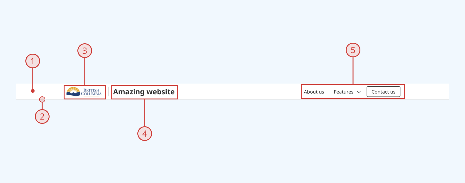
The header component has:
- A solid white background
- A solid grey bottom border
- A hyperlinked logo, on the left side of the component (defaults to the B.C. Mark)
- This includes a non-visible container for skip links
- A title area, to the right of the logo
- A container area for menu items, on the right side of the component
Behaviour
- By default, the header is not 'sticky' (it will not remain visible as the user scrolls down the page)
- Clicking or tapping the logo returns the user to the root of the site or application
- When the user presses the tab key, skip links appear in place of the logo
- As the user tabs through the header, focused options are indicated with a blue focus ring
- Title text wraps vertically at smaller viewport sizes, increasing header height proportionally
- At smaller viewport sizes, menu items should collapse into a toggleable 'hamburger' menu
Design guidance
Design system components are published in a Figma library. Install the library and add it to your project to start using this component.
The header component is built from several parts in Figma, to make it flexible for different use cases:
- A logo block on the left
- A title block, which displays your product or site's H1
- A flexible content area on the right, where you can swap in other components to compose a navigation menu or call to action
The header is designed to work well with the button component, which includes a 'Link' style intended for use in navigation.
A set of quickstart options are provided to populate the navigation area with placeholder content, for ease of prototyping.
Header controls
| Control | Options | Description |
|---|---|---|
| Logo | Swap |
Replaces the logo image (default is the B.C. Mark) |
| Subheader |
|
Toggles display of a secondary navigation menu below the main header. Note: this functionality is not supported in the React component as of v0.1.0 |
| Show title |
|
Toggles display of the title field |
Header content controls
| Control | Options | Description |
|---|---|---|
| Content |
|
Basic presets for navigation menu. Use the 'swap' option to compose a custom navigation layout |
| Info |
|
Toggles display of a generic 'information' icon in the toolbar |
| Search |
|
Toggles display of a search icon and link |
Technical information
Detailed technical documentation, interactive previews and code samples are published in the B.C. Design System Storybook.
A reference implementation of the header component in React is published in the React components library. Install the package via npm to start using the component.
The header component is built to be as flexible as possible, because navigation is extremely dependent on your application's business logic.
Supported props
The component includes props to configure:
- The logo image
- The logo hyperlink
- Skip link destinations
- Title content and styling
- Child elements (eg. menu items or buttons)
Accessibility
These summaries reflect the component used as provided. If you modify it, confirm that your changes comply with the Web Content Accessibility Guidelines (WCAG). B.C. government digital services are required to meet the WCAG Level AA standard.
| Requirement | WCAG Success Criterion | Validation |
|---|---|---|
| Allow users to resize text | 1.4.4 (Level AA) |
Header content reflows as user increases text size |
| Use responsive design to avoid losing content or context | 1.4.10 (Level AA) |
Header content reflows as viewport size decreases |
| Make websites keyboard accessible | 2.1.1 (Level A) |
Header is navigable and operable via keyboard, with visual indicators for focused elements |
| Prevent keyboard navigation traps | 2.1.2 (Level A) |
Header has no keyboard traps |
| Provide a way for people to skip repeated content | 2.4.1 (Level A) |
Header includes built-in support for skip links |
| Ensure content reads in the right order for people using assistive technology | 2.4.3 (Level A) |
'Tab' key moves focus state through header elements from left to right |
| Show where the keyboard is active on the screen | 2.4.7 (Level AA) |
Focused elements are indicated with a visible border |
| Ensure user interface components behave predictably | 3.2.1 (Level A) |
Header elements like menu items do not activate on focus, but when the user presses the enter key |
| Use consistent navigation | 3.2.3 (Level AA) |
Header content should remain consistent across all usages (configuration-dependent) |
| Make sure components can be read and used by assistive technology | 4.1.2 (Level A) |
Header is semantically identifiable as a <header> element |
