Select (dropdown menu)

Dropdown menus enable the user to select an option from a list.
On this page:
How to use this component
The select component enables the user to pick one option from a list.
Dropdown menus are useful when you need to display many options in a limited amount of space. They are commonly used in forms and search interfaces.
Use a dropdown menu only when:
- All of the possible options are pre-defined
- The user must pick a single option
- You have 7 to 15 options
In other cases, consider using an alternative input method (for example, check-boxes or radio buttons.)
Structure and behaviour
Anatomy

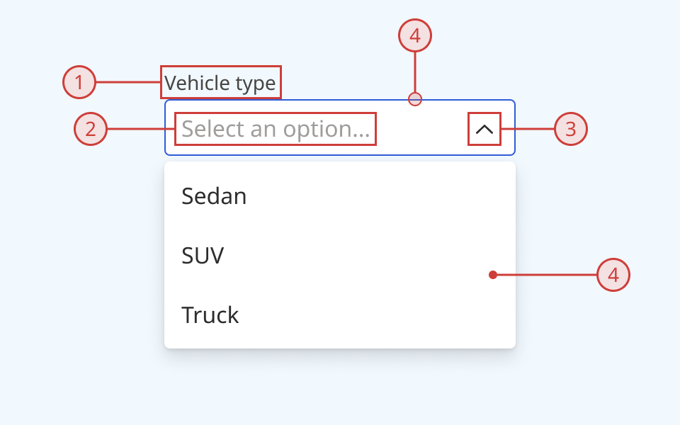
The select component has:
- A text label, which can also indicate whether a selection is required
- A selector with a text label
- A chevron icon indicating whether the list is currently open or closed
- A selection list box containing possible options
- Options can be organised into sections
- Each option can also have an icon and/or a description
An error message can be displayed below the selector when needed.
Behaviour

- The list of options is hidden from view until the user interacts with the selector
- Until the user selects an option from the list, the selector label shows a placeholder message
- The default content for this message is 'Select an item'
- When the user interacts with the selector, the list of options is shown
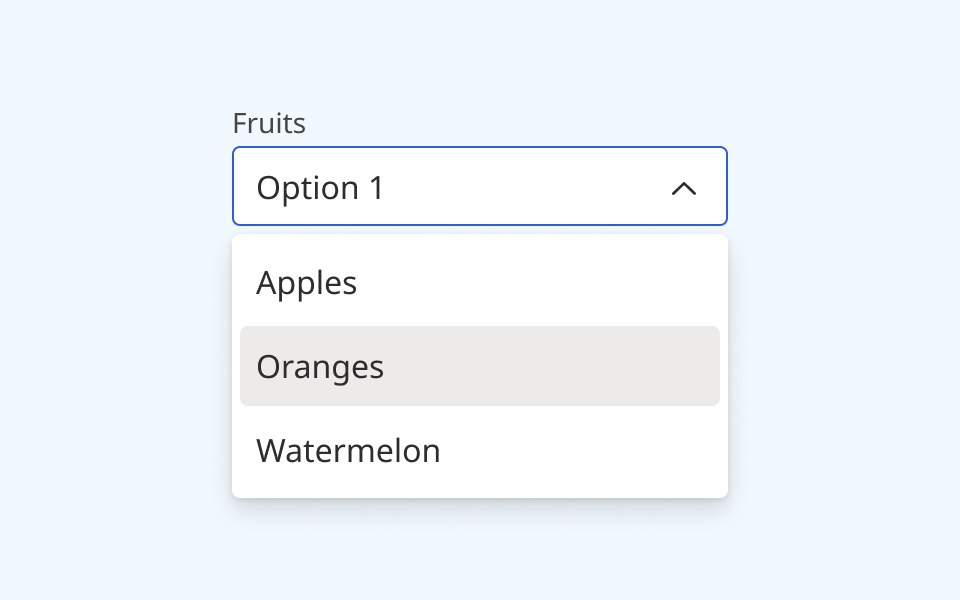
- When the user hovers over or focuses an option in the list, it is visually highlighted
- When the user selects an option from the list:
- The list box closes
- The selector label changes to the selected option
- If the selection is invalid, a red error message and warning icon are displayed below the selector
Design guidance
Design system components are published in a Figma library. Install the library and add it to your project to start using this component.
The select component is built from three parts:
- The selector
- The selection menu
- Individual list items
Each part has its own set of controls in Figma, for ease of prototyping.
You can customise how list items are styled, by:
- Sorting items into sections
- Displaying an icon next to some or all items
- Displaying additional description text under some or all items
You can also set an individual list item to a 'danger' state with a red colourway. Use this to provide an additional visual indication that the item is destructive (for example, 'Delete' or 'Remove'.)
Selector controls
| Control | Options | Description |
|---|---|---|
| Variant |
|
Toggles between the standard configuration and a more compact version with reduced vertical spacing |
| State |
|
Toggles the component between various interaction states |
| Label |
|
Toggles whether the text label above the selector is shown |
| Menu opened |
|
Toggles whether the selector is displayed open or closed |
Label controls
| Control | Options | Description |
|---|---|---|
| Label text |
String |
Sets the label text displayed above the selector |
| Required |
|
Toggles the display of a secondary label indicating whether an input is required |
Menu controls
| Control | Options | Description |
|---|---|---|
| Scrollable |
|
Toggles a scroll bar displayed on the right of the list box |
| Sections |
|
Breaks the list of options up into up to 3 sections |
| Section header |
|
Toggles a non-selectable section title at the top of a section |
| Danger |
|
Toggles an additional 'danger' item at the bottom of the options list, which can be used for destructive options like 'remove' or 'cancel' |
List item controls
| Control | Options | Description |
|---|---|---|
| State |
|
Sets the interaction state of an individual list item. Also used to set an individual item to the red 'danger' state |
| Description |
|
Toggles on/off additional helper or description text below an individual list item |
| Show left icon |
|
Toggles on/off an icon to the left of an individual list item |
| Show right icon |
|
Toggles on/off an icon to the right of an individual list item |
Technical information
Detailed technical documentation, interactive previews and code samples are published in the B.C. Design System Storybook.
A reference implementation of the tooltip component in React is published in the React components library. Install the package via npm to start using the component.
Events and props
The select component is a styled version of the React Aria select component.
The component supports props to configure:
- Required/optional status
- Enabled/disabled status
- Option customisation (sections, descriptions and icons)
- Default/placeholder text
Refer to the React Aria documentation for detailed information about:
Accessibility
These summaries reflect the component used as provided. If you modify it, confirm that your changes comply with the Web Content Accessibility Guidelines (WCAG). B.C. government digital services are required to meet the WCAG Level AA standard.
| Requirement | WCAG Success Criterion | Validation |
|---|---|---|
| Make sure visual formatting is represented in the backend code | 1.3.1 (Level A) |
Selector label and list are automatically associated via an aria-labelledby attribute |
| Clearly define the purpose of input fields | 1.3.5 (Level AA) |
The selector has a visible label, used to explain its purpose Note: if you do not use the label property, you must use aria-label to provide a semantic label |
| Make websites keyboard accessible | 2.1.1 (Level A) |
Selection menu is focusable and fully operable using only the keyboard, with visual indicators for focused elements |
| Prevent keyboard navigation traps | 2.1.2 (Level A) |
When in focus, the user can exit the selection menu by pressing the 'Escape' or 'Tab' keys |
| Ensure content reads in the right order for people using assistive technology | 2.4.3 (Level A) |
Focus moves through list options vertically from top to bottom |
| Show where the keyboard is active on the screen | 2.4.7 (Level AA) |
Focused elements are indicated with an offset border ring |
| Make sure interaction or click targets meet a minimum size | 2.5.8 (Level AA) |
The selector has a minimum target area of 40px by 40px |
| Ensure user interface components behave predictably | 3.2.1 (Level A) |
Selection menu does not open or close when focused. Selection options are not selected or deselected when focused |
| Make sure components can be read and used by assistive technology | 4.1.2 (Level A) |
The selection list is automatically associated to its label via an aria-labelledby attribute, and has the listbox role |
