Supplemental content - Promo box
Use the CMS Lite Promo Box to promote important related content.
On this page
Overview of the promo box
The promo box is a supplemental content box. It is used to highlight important related content. When implemented, it displays at the bottom of the page.
Sample promo box

Differences between Promo and Related Links boxes
The promo box differs from the Related Links component in the following ways:
- An image may be added
- The text field is mandatory
- Add new links is not available
Like all other components, all required fields must be completed or a warning message will be displayed when the [Save] action is invoked.
Image and link guidelines
Image guidelines
DPI (dots per inch) measures the resolution of an image, indicating its clarity and sharpness when displayed on a webpage.
Image format
JPG or PNG format is recommended for images.
Aspect ratio
Use an aspect ratio of 16:9.
DPI
Images uploaded should have a minimum dpi of 75.
- Review the Visual Design Guide for more specifications
Linking guidelines
Be aware of the following guidelines when adding links:
- When linking to applications or files, such as PDFs, opening new browser tabs or windows is acceptable
- When linking to other web pages, open hyperlinks in the same (current) window unless doing so will disrupt the workflow, confuse your audience, or terminate a secure session
Review Hyperlinks in the Web Standards for further explanation.
Always test links in Quality Assurance (QA) web server and the Production web server to ensure correct functionality.
Adding a promo box
To add a promo box to a page:
- Select the Right Column tab
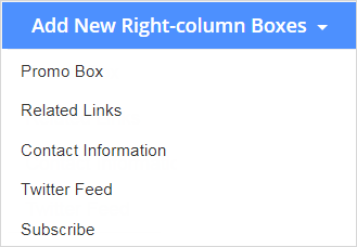
- Click the [Add New Right-column Boxes] action button and choose Promo Box from the drop-down list
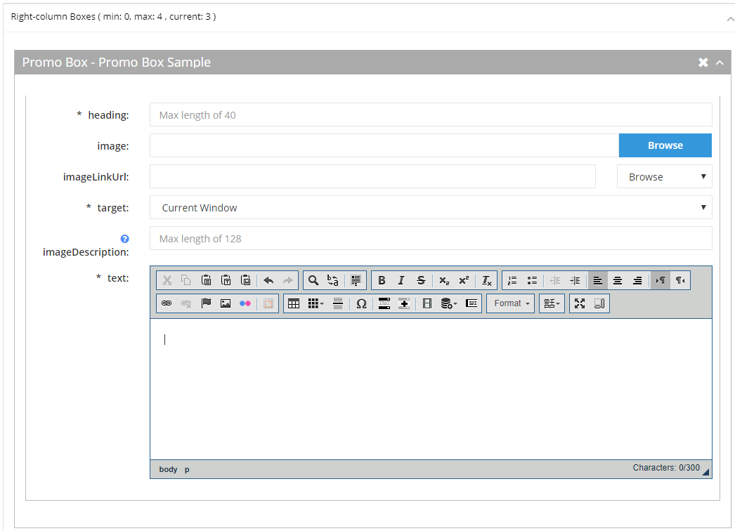
The Promo Box component will be displayed
Click image to view in full screen
- To add an Image, click on the [Browse] button
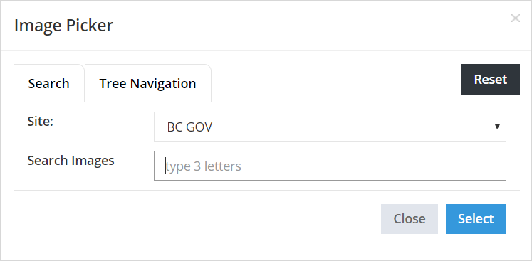
The Image Picker will be displayed
- Search or Navigate to the applicable asset which has been uploaded into Asset folders
- Choose the [Select] to complete the action
The picker will be closed and the image field will be populated
- The Image Link field is optional; however, you may to link to a page/asset, or enter an external URL
- Enter a secure external URL (include https://), or
- Select the Browse drop-down menu and choose the applicable option
The applicable picker will be displayed
- Search or Navigate to the page/asset
- Choose the [Select] to complete the action
The picker will be closed and the imageLinkUrl field will be populated
Note: Target should be changed to New Window if linking to an asset
- Type a description of the image in the Image Description field to be displayed on hover and read by screen readers
- Maximum 128 characters
- If your image is purely decorative, leave this field blank so screen readers will ignore it
- Enter up to a maximum 300 characters into the required Text field


Expanding, rearranging and deleting components
Expand existing components
When editing an existing page with supplemental content boxes, the components will initially be collapsed. Click on the Item Control Bar to expand/collapse the component
Delete components
Click the delete icon ![]() to remove a component or replicant field
to remove a component or replicant field
Rearrange components
Hold the left mouse button down on the Item Control Bar to drag and drop to reorder the components or replicant fields

